Typeface anatomy
Lua error in package.lua at line 80: module 'strict' not found.
Typeface anatomy describes the graphic elements that make up printed letters in a typeface.[1]
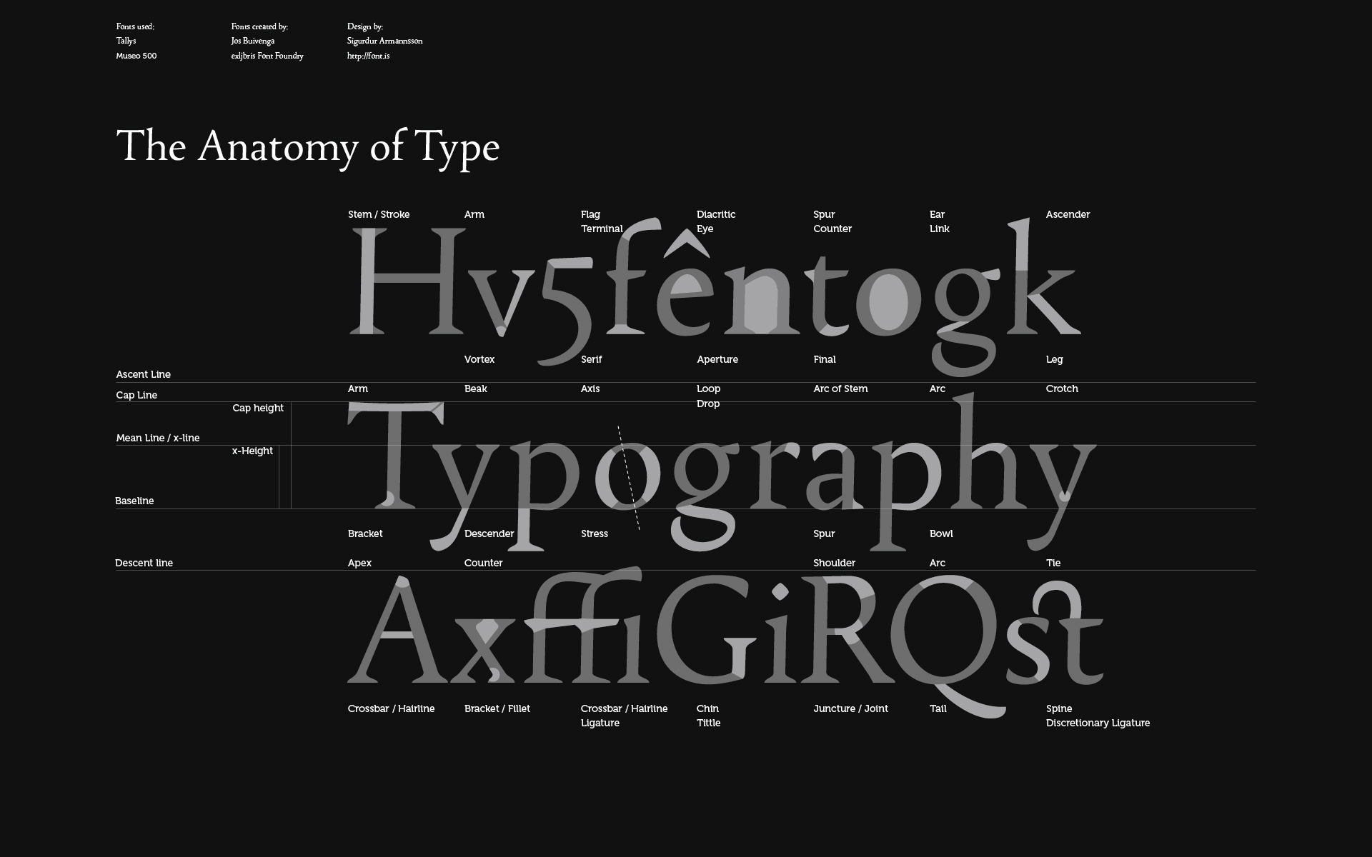
The strokes of a letter are the lines that make it up. Strokes may be straight, as in k l v w x z, or curved, as in c o s. If straight, they may be horizontal, vertical, or diagonal; if curved, open or closed. Typographers also speak of an instroke, where one starts writing the letter, as at the top of a c f, and an outstroke, where the pen leaves off, as at the bottom of c e j k t y.
<templatestyles src="Template:Quote_box/styles.css" />
Typefaces are born from the struggle between rules and results. Squeezing a square about 1% helps it look more like a square; to appear the same height as a square, a circle must be measurably taller. The two strokes in an X aren't the same thickness, nor are their parallel edges actually parallel; the vertical stems of a lowercase alphabet are thinner than those of its capitals; the ascender on a d isn't the same length as the descender on a p, and so on. For the rational mind, type design can be a maddening game of drawing things differently in order to make them appear the same.
A main vertical stroke is called a stem. The letter m has three, the left, middle, and right stems. The central stroke of an s is called the spine. A stroke, usually a stem, which rises above the height of an x (called the x height) is called an ascender; letters with ascenders are b d f h k l. A stroke which drops below the baseline is a descender. Letters with descenders are g j p q y. An arching stroke is called a shoulder or sometimes just an arch, as in h n m. A closed curved stroke is called a bowl in b d o p q D O P Q R; B has two bowls. A trailing outstroke, as in j k y J K Q R is called a tail. A short horizontal stroke, as in the center of e f t A and the middle stroke of E F, is called a bar. A longer horizontal stroke at the top or bottom, as in E F L T, is called an arm. The bottom of the two-story g is called a loop; the very short stroke at the top is called the ear. i j each have a dot or tittle. Angles of strokes are called apices if at the top and vertices if at the bottom. w has one apex and two vertices; v has one vertex.
The terminals (ends) of instrokes and outstrokes often end in serifs in a serif font. A serifed or unserifed terminal may be described as a wedge, bulbous, teardrop, etc., depending on the design of the type. Some designs also have spurs, which are smaller than serifs and appear on angles rather than at a terminal, as on e or G.
Areas of negative space (white space) formed by straight or curved strokes are called counters. Closed counters are found in a b d e g o p q A B D O P Q R, and open counters in a c e f h m n r s t u. Angles of white space, as in w, are corners (w has three corners); the term is not used for angles of strokes. The small corner formed by a serif, whether curved or angular, is called the serif bracket.
The font shown in the example is stressed: strokes have varying widths. In this example, the stroke at the top of the g is thinner at the top and bottom than on the sides - a vertical stress.
References
External links
| Wikimedia Commons has media related to Examples of typography terms. |
- Type Anatomy
- Font Anatomy (source)
- eXtreme Type Terminology – Part 2 and Part 3
- The Anatomy of Type (2012, Harper Design) - a book with anatomical analysis of 100 typefaces
| Page | |||||||||||
|---|---|---|---|---|---|---|---|---|---|---|---|
| Paragraph | |||||||||||
| Character |
|
||||||||||
| Typeface classifications |
|
||||||||||
| Punctuation | |||||||||||
| Typesetting | |||||||||||
| Typographic units | |||||||||||
| Digital typography | |||||||||||
| Related articles | |||||||||||
| Related tables | |||||||||||